ConsenSIS
Integrated branding system for ConsenSIS, a project led by Yolanda Wisher and Trapeta B. Mayson that seeks to count, gather, and memorialize Black women & femme poets in Philadelphia, past and present.
AWARDS + FEATURES
2022 SURVEY REPORT
Browse the results on the ConsenSIS website.

In partnership with Monument Lab’s ReGeneration program and led by former Philadelphia Poet Laureates Yolanda Wisher and Trapeta B. Mayson, ConsenSIS “summons and preserves ‘sisterly history’ to spark new traditions that commemorate a vital creative community in the Philadelphia area where Black women’s contributions to history are often buried under cobblestones and colonial landmarks.”
ADDITIONAL CREDITS
Yolanda Wisher, Project Leader
Trapeta B. Mayson, Project Leader
Jaléssa Savage, Project Manager
Maya Arthur, Marketing Manager
Mai Eltahir, Data Curator
-
To build a visual identity that addressed ConsenSIS’ needs, I began by workshopping with the client and doing a deep dive into historical, cultural, and location-based research. Readings like Black Poets Write On! An Anthology of Black Philadelphian Poets and Black Print: Early African American Print Culture alongside lectures such as W.E.B. Du Bois’s Data Portraits: Visualizing Black America heavily informed design decisions and process. By taking this knowledge into consideration alongside the direction the ConsenSIS team wanted to move in, which sought most importantly to uplift and memorialize the voices and presence of Black women and femme poets in Philadelphia, a visual identity was formed.
The color palette challenges the typical practice of black ink on white paper and instead emphasizes the presence. power, and softness of blackness, intertwining it with pops of goldenrod and blood orange alongside wispy lilac and rich 70s-era chartreuse.
Typography choices were made deliberately, using Vocal Type Co.’s DuBois type family, which is directly inspired by DuBois’ data visualization work, as the typographic focal point, with ribbons of pocket-notebook-script Quimby Mayoral scattered throughout and complimented with a touch of Beau, an elegant serif designed by Tapiwanashe Sebastian Garikayi.
The logo family was inspired by curved frames, banners and text discovered during the research phase, and combines these with a more geometric icon created from the counter of the “O” in the DuBois type system that could be interpreted as a plethora of items (our favorites were a portal, a mirror, or a gem). A variety of marks were designed to be applied to various components as needed, all of which pull from the primary mark which centers the notion of “sisterly affection,” a phrase that became particularly meaningful to the project team.
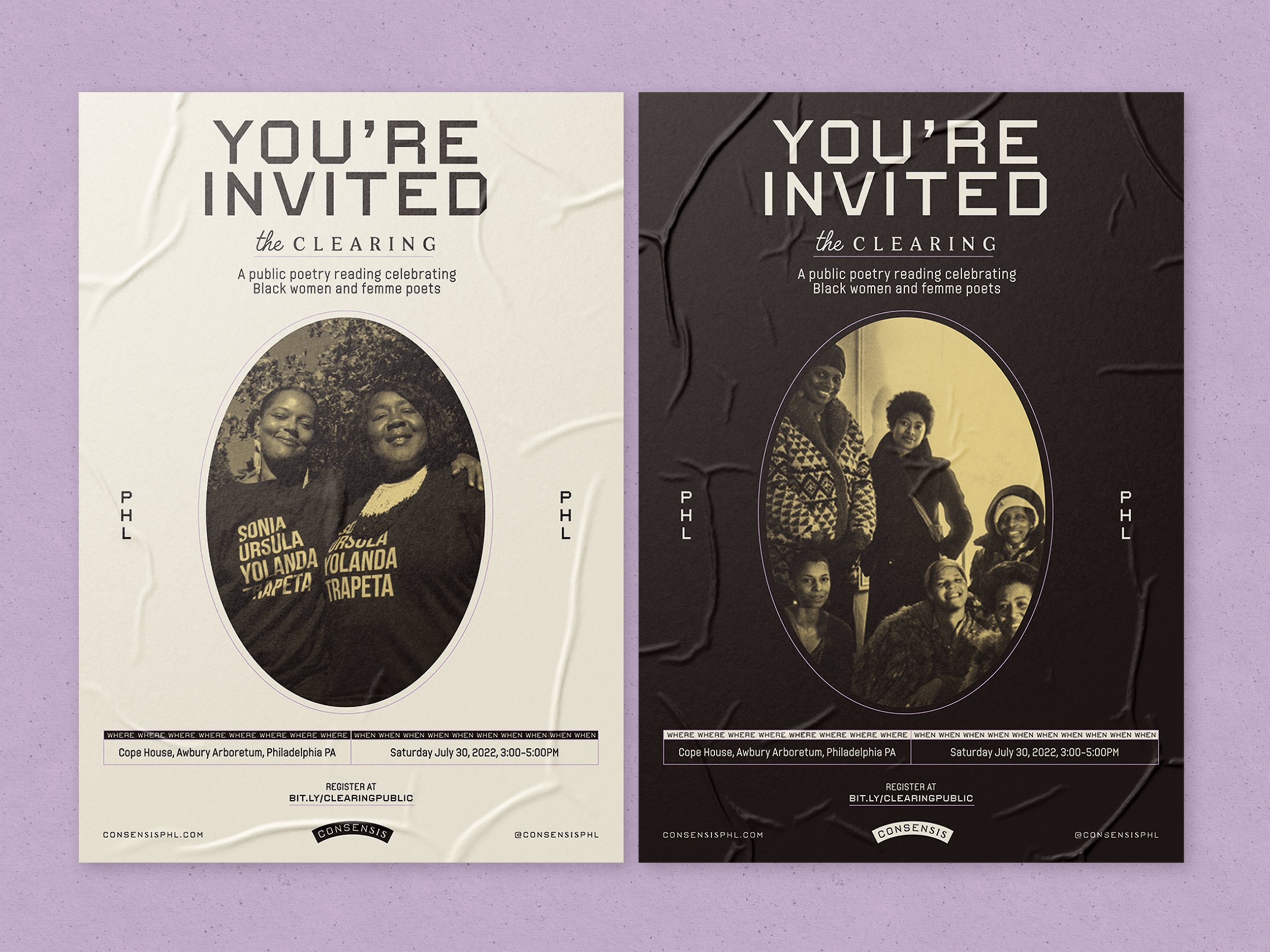
Imagery is treated with a creamy sepia duotone reminiscent of early documents and vintage photographs, and important images are delicately framed using an oval shape seen frequently in early Black print materials.
These elements combined create a visual system that is empowering yet approachable, bold but soft, and rooted in poetic history. Explore the system below, applied to various print and digital components including a heavy social media presence, a custom microsite, and swag items, and be sure to give ‘em some love on social to help spread the word.